
The Grocery Rebrand

For most of the last decade, the future of groceries was written in the language of convenience. Fifteen-minute delivery. Dark stores humming quietly on the edge of every neighborhood. Apps that remembered your usual order so you never had to think about it again. The weekly shop was treated as a problem to be solved, a chore to automate, outsource, and eventually forget.
The logic seemed unbeatable. Why walk the aisles when an algorithm could do it for you? Why stand in line when checkout could disappear entirely? For a while, the smartest money in food was betting that the physical grocery store was on its way to becoming a warehouse: invisible, interchangeable, something you ordered from but never actually visited.
And yet the grocery stores generating the most cultural energy right now are doing the exact opposite.
They are asking you to show up. To slow down. To browse. To discover something you did not come in for. To be seen while you do it.
These are not the most convenient places to buy food. Often they are the least. They are more expensive, more crowded, harder to reach, and slower to move through. People are choosing them anyway, lining up around the block for the privilege.
The grocery store was supposed to disappear into an app. Instead, it became a place worth going.
Call it the concept grocery: part market, part gallery, part clubhouse. A store built less around efficiency than around identity, where the errand becomes an experience and the experience becomes a kind of belonging. What you put in the basket almost matters less than what it says about you, and who you run into while choosing it.
And the thing doing that work is design. The architecture, the lighting, the logo on the bag, the way the product is stacked: these brands treat a grocery store the way a fashion house treats a flagship. Get the design right and the whole act of shopping changes character, from a task you complete into a place you choose to spend time.
The concept in practice
Meadow Lane, New York
Grocery as a designed sanctuary.
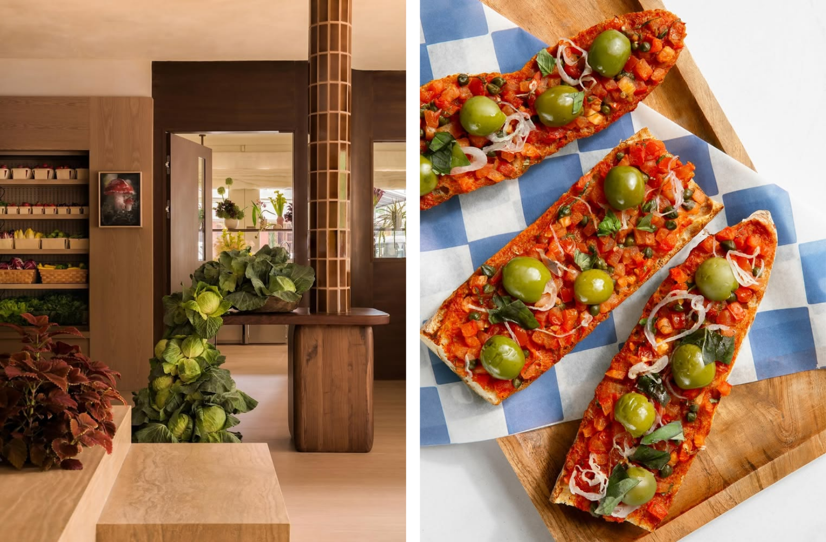
Meadow Lane treats a grocery store as a total design project. A gourmet grocer in Tribeca from Sammy Nussdorf, its interiors were created by designer Sarah Carpenter in warm wood and plaster, a deliberate sanctuary set against the sterile, fluorescent look of the usual supermarket. The curation is just as considered: a rotating art program of international artists, sculptural floral displays, scent carried through the air, a soundtrack to shop to, and a pantry pared back to a single best-in-class brand in each category. When it opened in late 2025 the lines ran around the block, drawn less by the groceries than by the feeling of the room and the sense that every last detail had been chosen for you.
Happier Grocery, New York
Grocery as discovery.
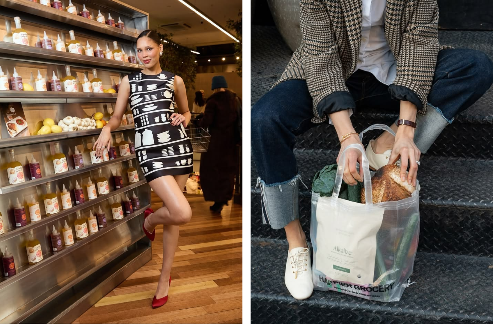
Canal Street's self-described "grocer + lifestyle." Floors of hyper-curated wellness food sit beside an apparel and sunglasses line, a flower shop, fashion collaborations, and a room of rare magazines, all merchandised like a gallery. That presentation reframes the visit: it feels like browsing a point of view rather than stocking a pantry. Most people walk in without a list, asking staff what to try, and Founder Fridays bring brand founders in to hand out samples. The whole place is designed around the find.
Laurel Supply, West Hollywood
The angle: grocery as design and preservation.
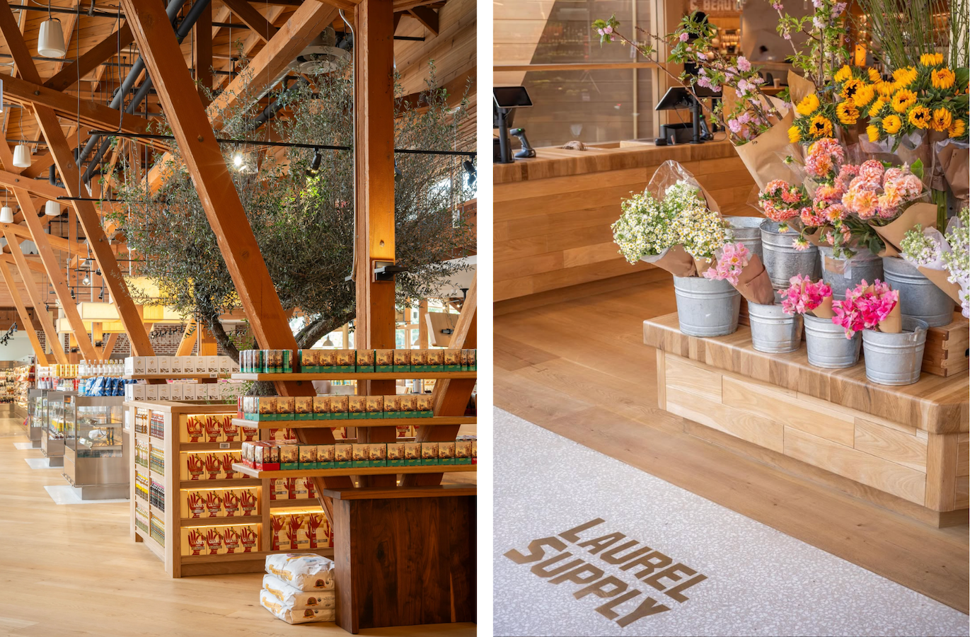
A luxury market from the team behind Laurel Hardware, set inside a restored 1940s midcentury landmark (the former Ritts Co. furniture showroom, once owned by the parents of photographer Herb Ritts). Grain is milled and bread is baked behind glass so you can watch. Produce is arranged like a still life. Here design carries the entire proposition. Shopping inside a preserved landmark, watching grain turn into bread, reframes the grocery run as something closer to visiting a place, and lets provenance become something you watch happen rather than a claim printed on a label. It opened with no press release, no website, and no promotion, letting a private, zero-follower Instagram and a line out the door do the work. Anticipation as marketing.
Erewhon, Los Angeles
The angle: grocery as status.
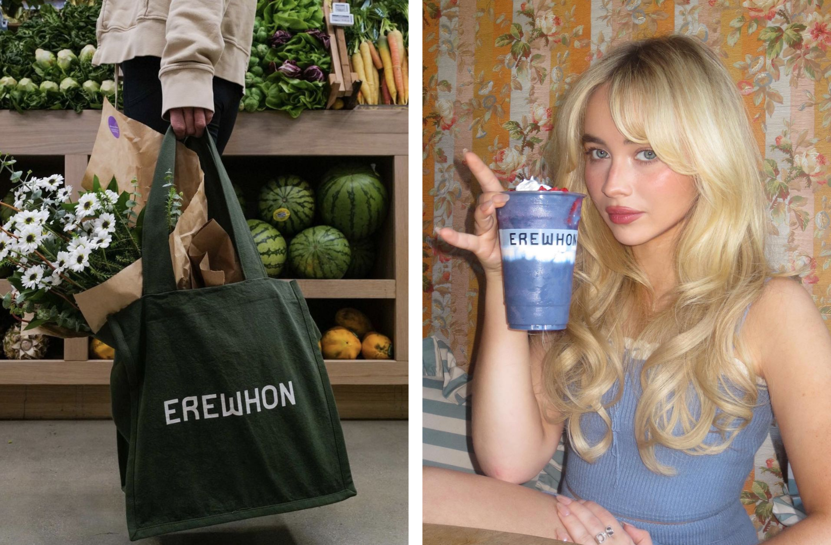
The store that started the genre. Its celebrity smoothie collaborations became status objects, and now the new Reserve tier turns loyalty into something closer to a private members' club. But the membership only works because the world around it is so carefully art-directed. Erewhon's calm, apothecary-white interiors and understated branding make an ordinary bottle of water feel like a luxury object, which is what lets the weekly shop double as a status ritual. People meet for dates in the aisles.
Others worth a look
- Pop Up Grocer, New York
- Big Night, New York
- La Grande Épicerie de Paris, Paris
- Eataly, Global
- Daylesford, Cotswolds & London
- The Goods Mart, New York
- Depachika, Tokyo
- KaDeWe Food Hall, Berlin
Why it matters
These stores look nothing alike. A milled-grain bakery in a midcentury landmark. A members' club smoothie counter. A magazine room next to the kombucha. But they are all answering the same quiet question:
If a screen can deliver anything to your door, what is a store actually for?
Their answer is that a store is for the things an app cannot send: atmosphere, discovery, ritual, status, the small theater of choosing in public. The concept grocery understands that once convenience is solved, the only thing left to sell is meaning. And people will happily pay more, wait longer, and travel further for a version of an errand that makes them feel part of something.
And in every case, the tool doing the persuading is design. The architecture, the branding, the lighting, the edit on the shelves: this is what convinces a guest that a carton of eggs is worth a special trip, and it is quietly rewriting what people expect a grocery store to be.
The weekly shop, it turns out, was never only about food. It was about belonging.
These are the stores that remembered.